The Pantone Color Institute just announced 2019’s “color of the year,” so we can expect to see a whole lot of it showing up in design, décor, fashion, and of course… advertising.
So what is it?
Drumroll please… the 2019 Pantone Color of the Year is called: Living Coral.
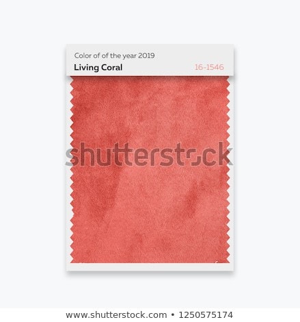
Here’s what the folks at Pantone say about Living Coral:
“An animating and life-affirming coral hue with a golden undertone that energizes and enlivens with a softer edge. Vibrant, yet mellow PANTONE 16-1546 Living Coral embraces us with warmth and nourishment to provide comfort and buoyancy in our continually shifting environment.”

In terms of stock photos, this color can symbolize optimism, joy, lighthearted activity, and playful expression. The stock shot above definitely conveys these things in a beautifully simple way. (If you want to read more about why they chose “Living Coral,” check out Pantone’s site here.)
As stock photographers, it’s important to stay in the loop, because photos of this color will likely do very well in the year ahead.
In fact, if you take new shots featuring this color (or already have photos in your stock portfolios that feature it), be sure to add these keywords right away: living coral, color of the year 2019, Pantone, and 16-1546 (so that buyers can find your image).

And if you have some downtime over the holidays, you could make a fun stock photo project out of this.
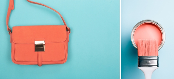
Keep an eye out for coral colored props, backgrounds, and clothing that you can use. And don’t forget that opposite colors create fun, high-energy images that really pop. Try pairing coral with light blue or teal like the photographers did in these two shots:
Grab your camera and keep a lookout for 2019’s most popular color. The sooner you get these images uploaded to your stock sites, the sooner they’ll start selling in the year ahead!

