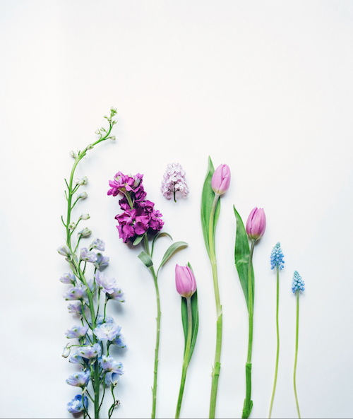
Last week we took a look at this stock photo by my friend Sarah. It’s so simple… and yet, it’s one of her best-sellers.
If you want to try some shots like this in your own home, see how she did it, here.
This week, we’re going to take a closer look at one of the most important elements that made it work: white balance.
In simplest terms, white balance refers to the color of the light in your photograph.
All light sources cast some type of color. But our eyes adjust so fast that you don’t always see it. However, the camera does.
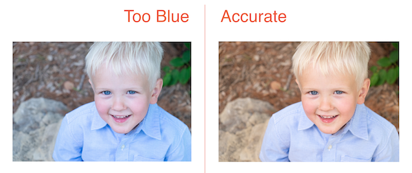
For example, fluorescent lights cast a greenish hue and shooting in the shade makes things look blue, as you can see in this portrait on the left:
No, our eyes adjust to it, and your camera can do a pretty good job, too, if you put your white balance on “auto.”
But every now and then a photo will still have a strange color to it. When that happens… it’s Lightroom to the rescue!
For example, just like the portrait above, the original flower image was too blue. However, a simple adjustment in Lightroom brought the photo from too blue (on the left), to just right.
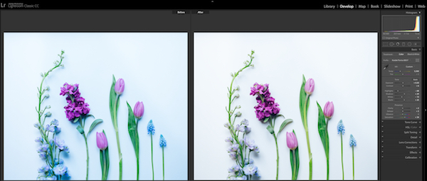
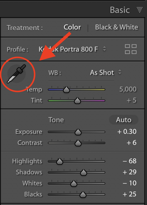
All you have to do is click on the eyedropper in the white balance (WB) area of Lightroom’s Basic Panel (see below), and then click on something neutral in your image, such as the plain background in the flower photo. By “neutral,” I mean anything in the image that should be gray.
And voilà! Just like magic, the white balance is fixed.
If it’s not quite right, try clicking around in various neutral-toned areas as each time, it will adjust a little differently.
Try this trick on any image that seems like it’s just not quite the right color, and odds are the problem will be solved and you’ll have a better stock photo to submit to your agencies.